Product Rebrand
Accessibility, usability, branding
Overview
What
I rebranded our SaaS web app to increase usability and accessibility; create alignment between the corporate and product brands; and provide a cleaner, more modern UI that reflects the product’s maturity and serves as a foundation for its continuing growth and evolution.
Why
The rebrand was motivated by three main factors: 1) Marketing launched a new corporate brand in early 2020, 2) an accessibility review revealed areas where the product was failing to meet WCAG AA guidelines, and 3) customers and sales prospects thought our UI was dated and wanted customization options.
How
After determining my goals and strategy, I identified research-informed product brand attributes to guide UI changes. Based on stakeholder feedback, I then created four branded color themes and worked closely with a developer to implement the ability to white label the product. We implemented the changes in stages to avoid notable disruptions to our customers.
Role: I was the sole researcher and designer on this project.
Team: I collaborated closely with stakeholders across the company during research and design and with our front-end developer during design and implementation.
Timeline: The work described here took place on and off over a period of approximately 18 months. Much of the research and initial design work was completed over a period of approximately 6 months, but development was constrained by limited front-end resources.
Background
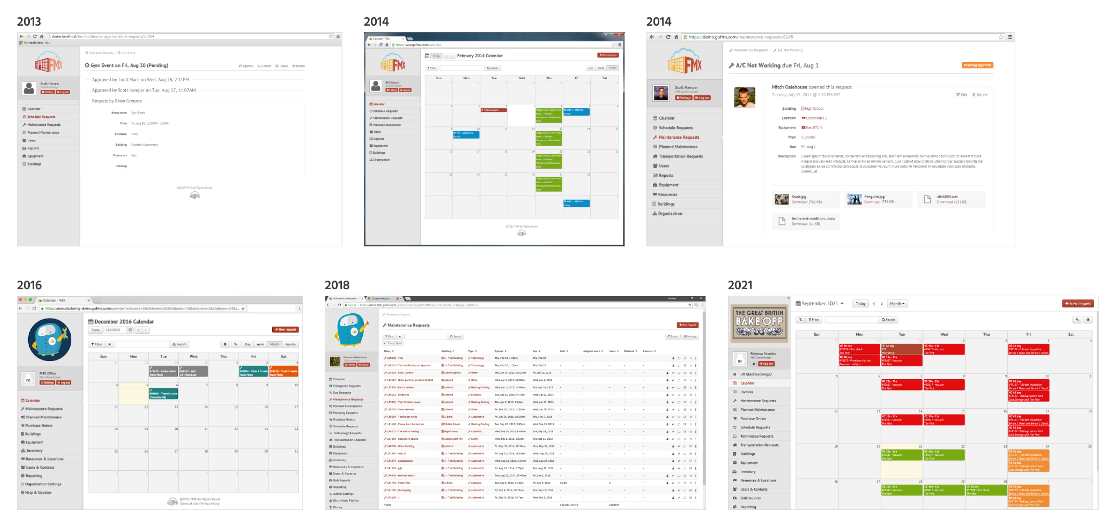
Before I joined the company in fall 2019, FMX had never had a UX or product designer. Instead, the product design had been led at various times by the founders, the developers, and engineering managers. This resulted in inconsistencies in the UI, a lack of accessibility, and a dated visual design.
Research
Rebranding a SaaS product is a complex and delicate task. To start, I researched corporate and product brand strategies, interviewed stakeholders across FMX, and analyzed our existing product brand. My research led to the following conclusions:
- Updating our product brand would improve usability and accessibility
- Customizing our UI through rebranding would allow us to more clearly distinguish ourselves visually as a product from other products built with the same framework
- Creating consistency between the corporate and product brands would help build customer trust
- Our customers and prospects ultimately saw our corporate and product brands as separate and preferred the product to not be heavily branded
After conducting a competitive analysis, reviewing customer feedback on public sites, and talking to customers and stakeholders, I developed a short list of possible product brand attributes. I put this list to a stakeholder review and vote, and after some analysis, settled on our new brand attributes of easy to use, reliable, streamlined, approachable, and innovative.
New Brand Attributes
Easy to use: FMX proudly focuses on putting our users and their needs at the center of all we do. Software that solves problems shouldn’t be a problem to use, which is why we emphasize ease of use in our product design.
Reliable: FMX knows our users rely on our product to keep their workflows moving, which is why we work hard to make sure that FMX is always working for them.
Streamlined: FMX strives to provide solutions tailored to the particular problems and needs of each of our users. The result? A streamlined experience that presents our users with the features and functions they need and doesn’t clutter their screen with ones they don’t.
Approachable: FMX recognizes that no software solution is successful without user buy-in. That’s why we design FMX to be approachable for new users and expert users alike.
Innovative: FMX understands that our users’ needs are constantly changing as the world changes around us, and thus we are always innovating to make sure we are meeting our users’ current needs and anticipating their future ones.
Design
Moving into the design phase, I had to balance several competing concerns:
- Improving the accessibility and usability of the UI
- Creating synergy with the corporate brand
- Incorporating the new brand attributes into the product design
- Making effective use of limited development resources
- Maintaining a good experience for existing customers
Usability and Accessibility
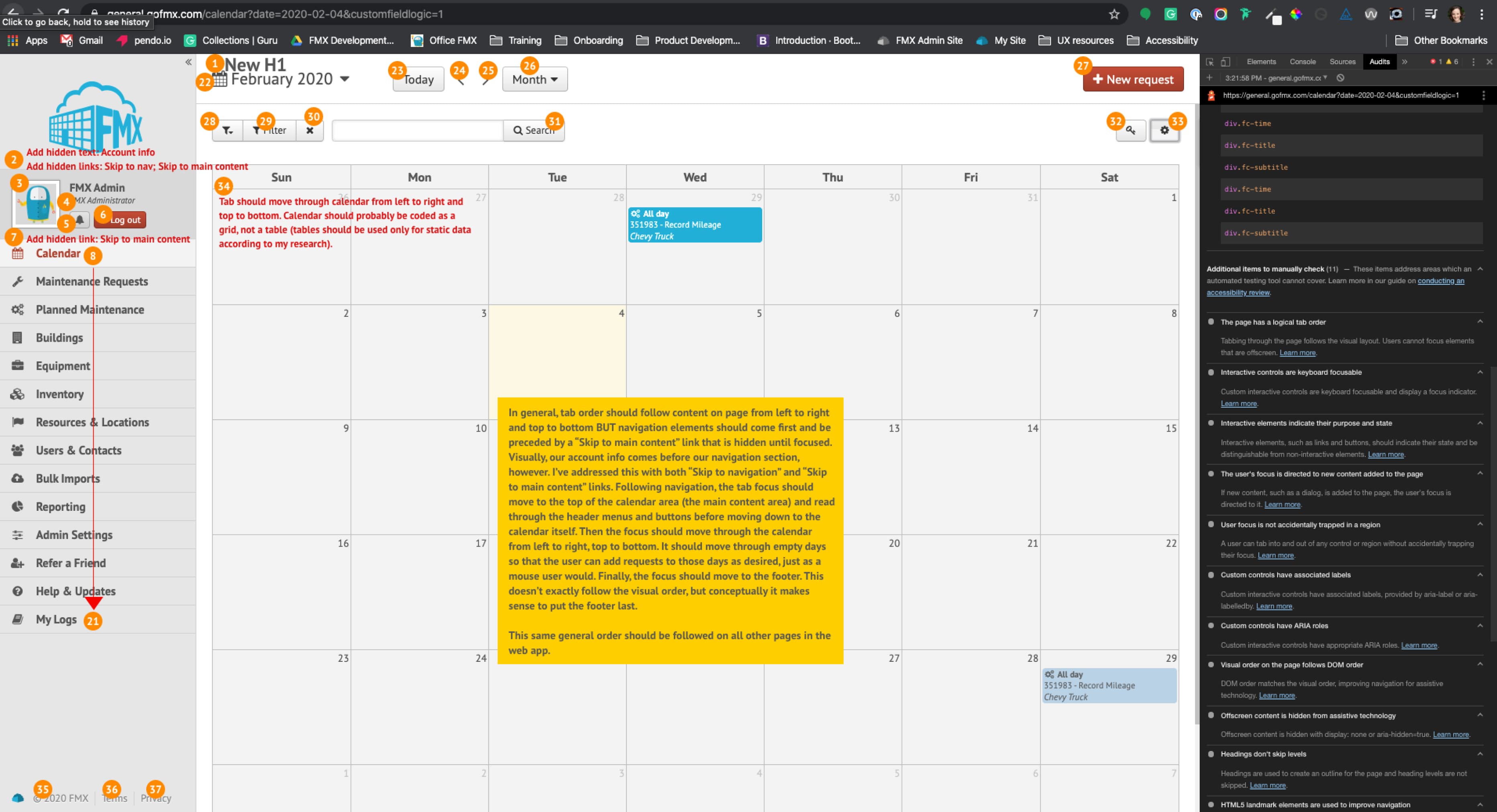
I focused first on creating a clear visual hierarchy on each screen with consistent header use, which would also make our product more accessible to screen readers. I borrowed the new heading font from the corporate brand, creating a bridge between the two brands.
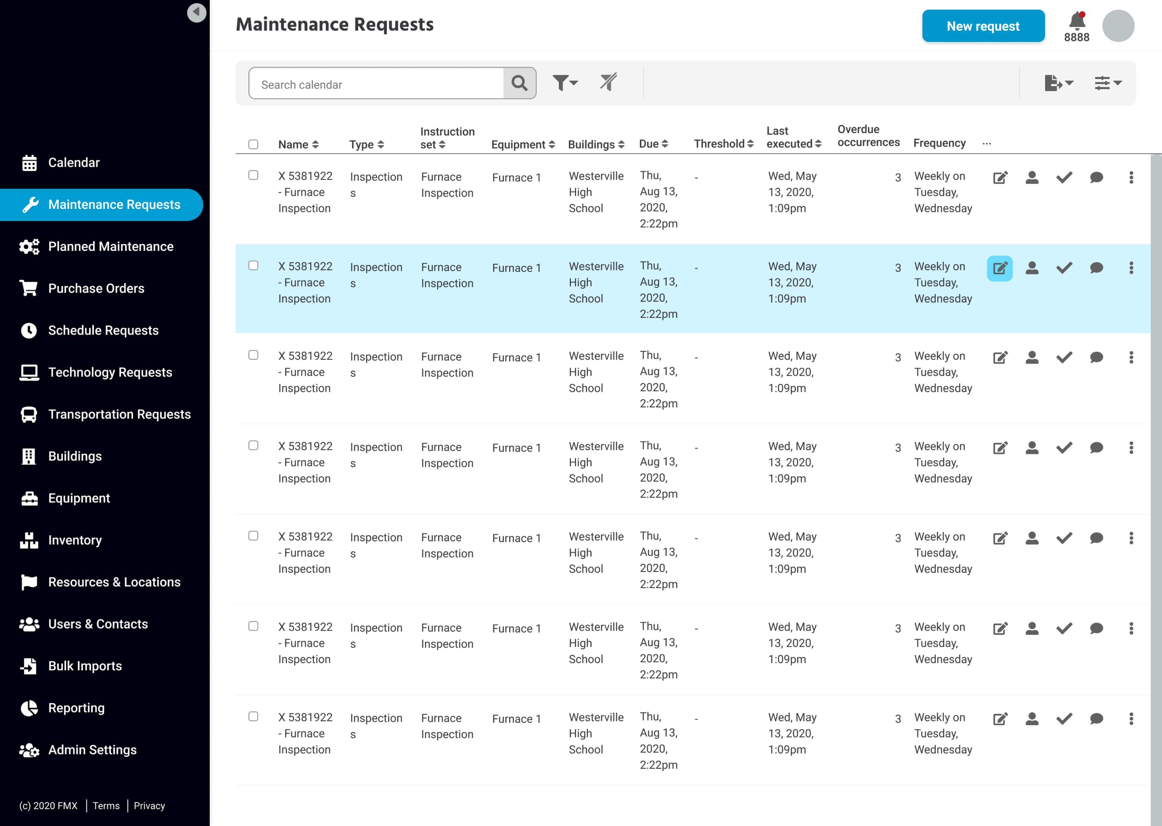
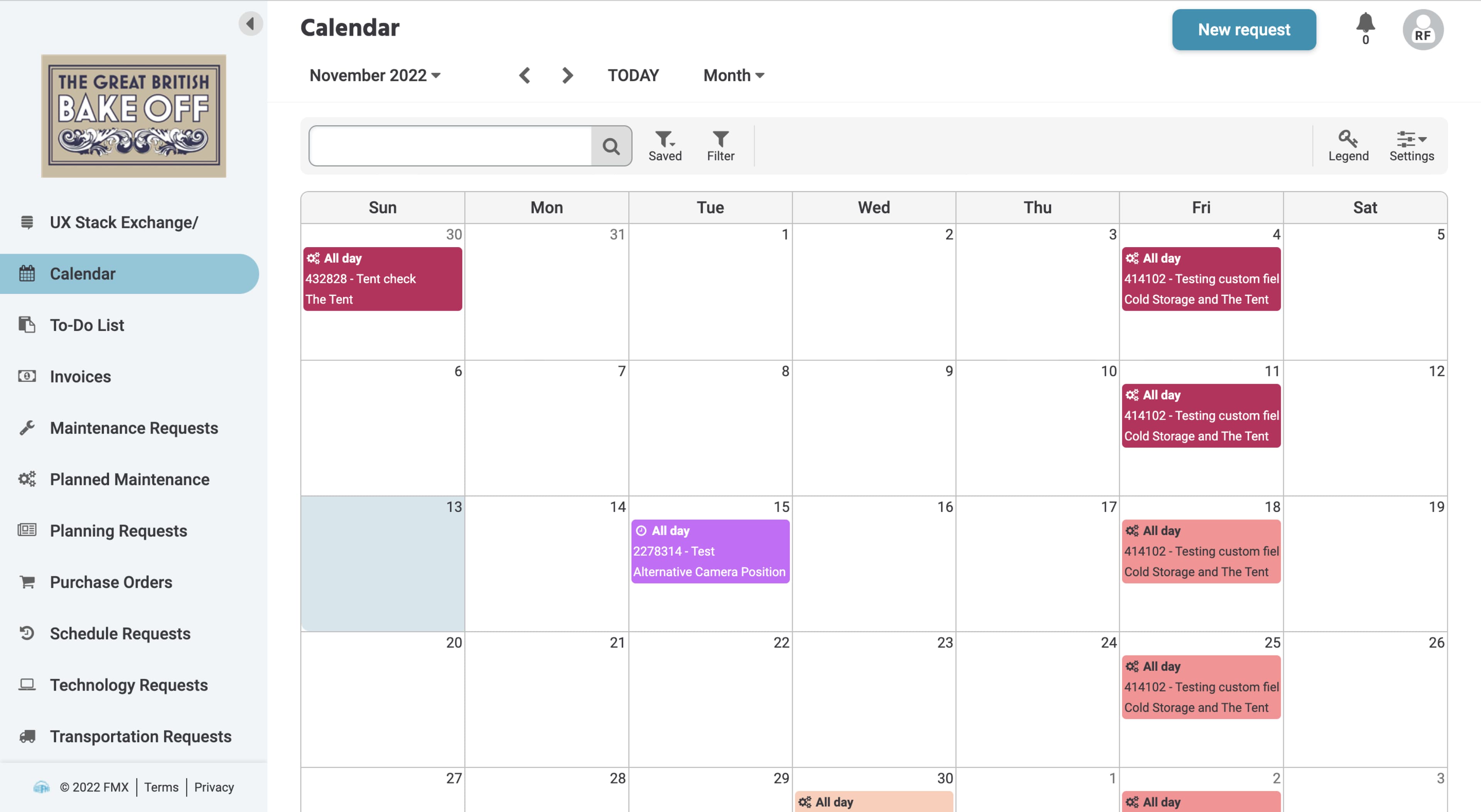
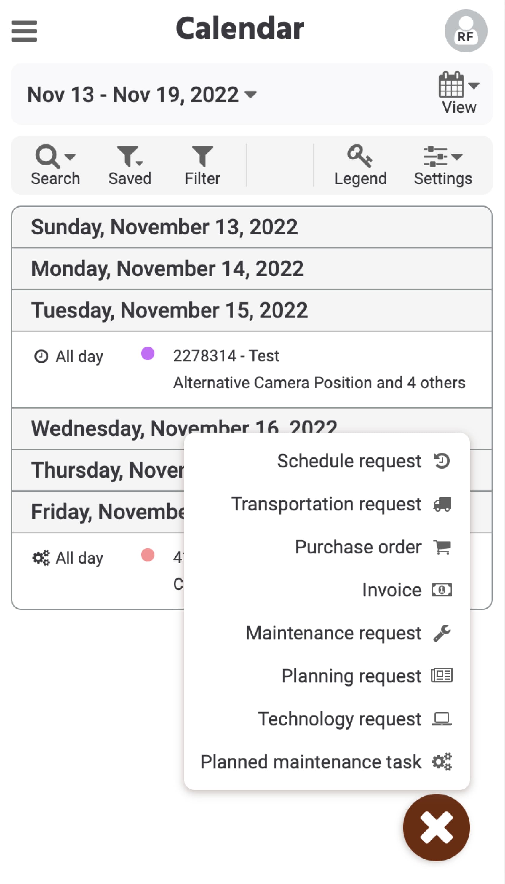
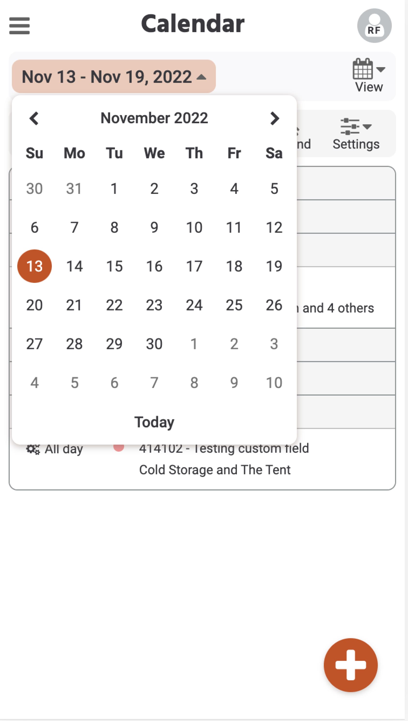
I also audited the interactive components in the product to ensure they were being used consistently and to their intended purpose, with the result that the headers of several pages, including our main calendar page, had to be noticeably redesigned to accommodate changes in components.
Accessibility and usability updates
- New color palette to meet WCAG AA color-contrast ratios
- Updated font sizing and line spacing to meet WCAG AA guidelines
- Tab order updates
- Hierarchical heading structure on every page
- Revampled interactive component usage for consistency and intentional usage
- Native HTML element usage
- Recommended use of ARIA labels as needed
- Clear hover and focus states on every interactive element
- Increased touch target sizes, especially on mobile view
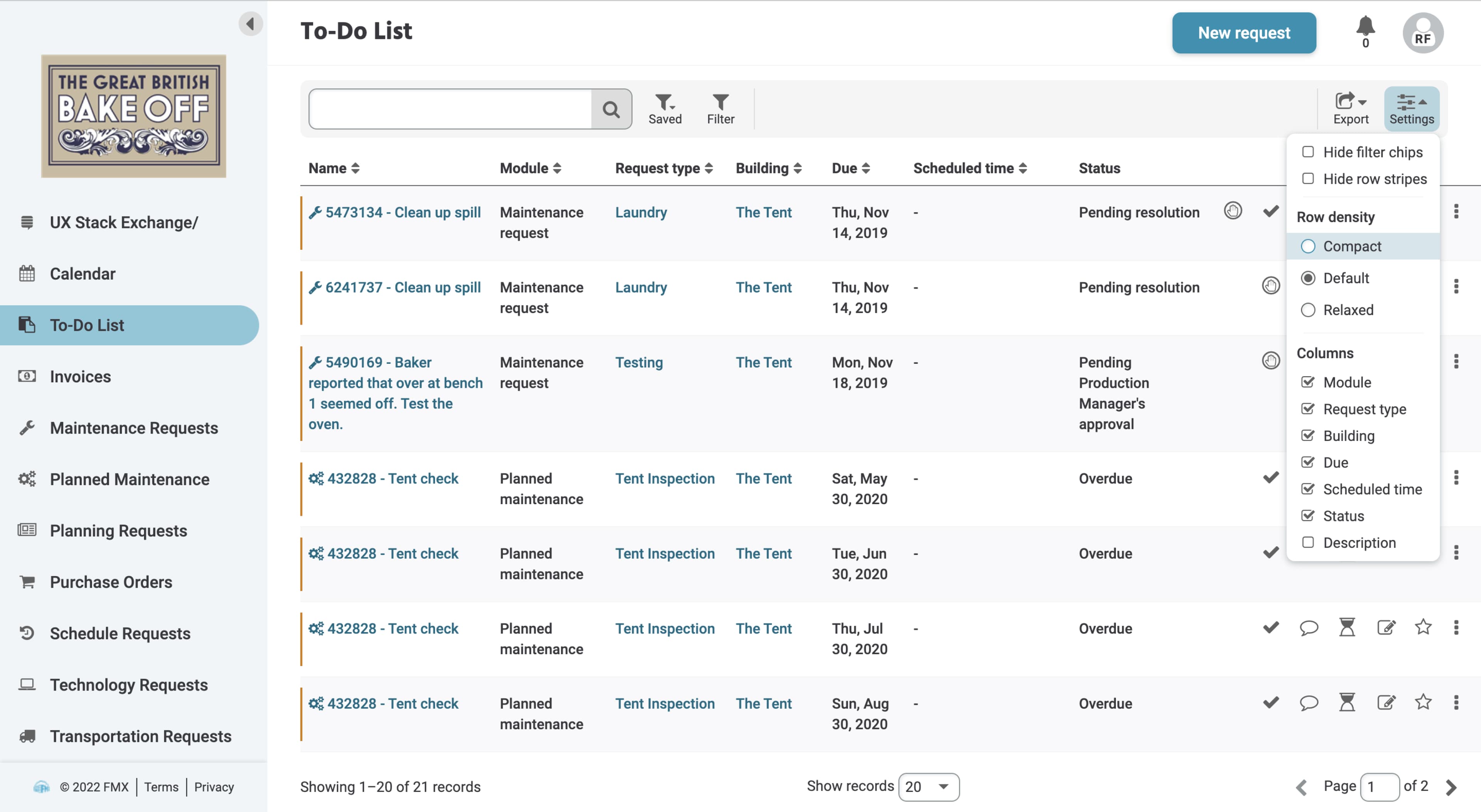
- Grid-row density options with “relaxed view” for accessibility
- Added white space
- Added breadcrumbs for easier navigation
- Decluttered grid by reducing extraneous icons and buttons
- Replaced mobile dropdown menus with slideouts
- Moved some elements, such as profile/account, to new places in layout to match user mental models
- Added text labels to buttons for ease of use
- Made “overdue” indicator more distinct
- Made grid column heads and action buttons sticky to reduce cognitive load and scrolling
- Added scrolling and progress indicators where missing
Branding
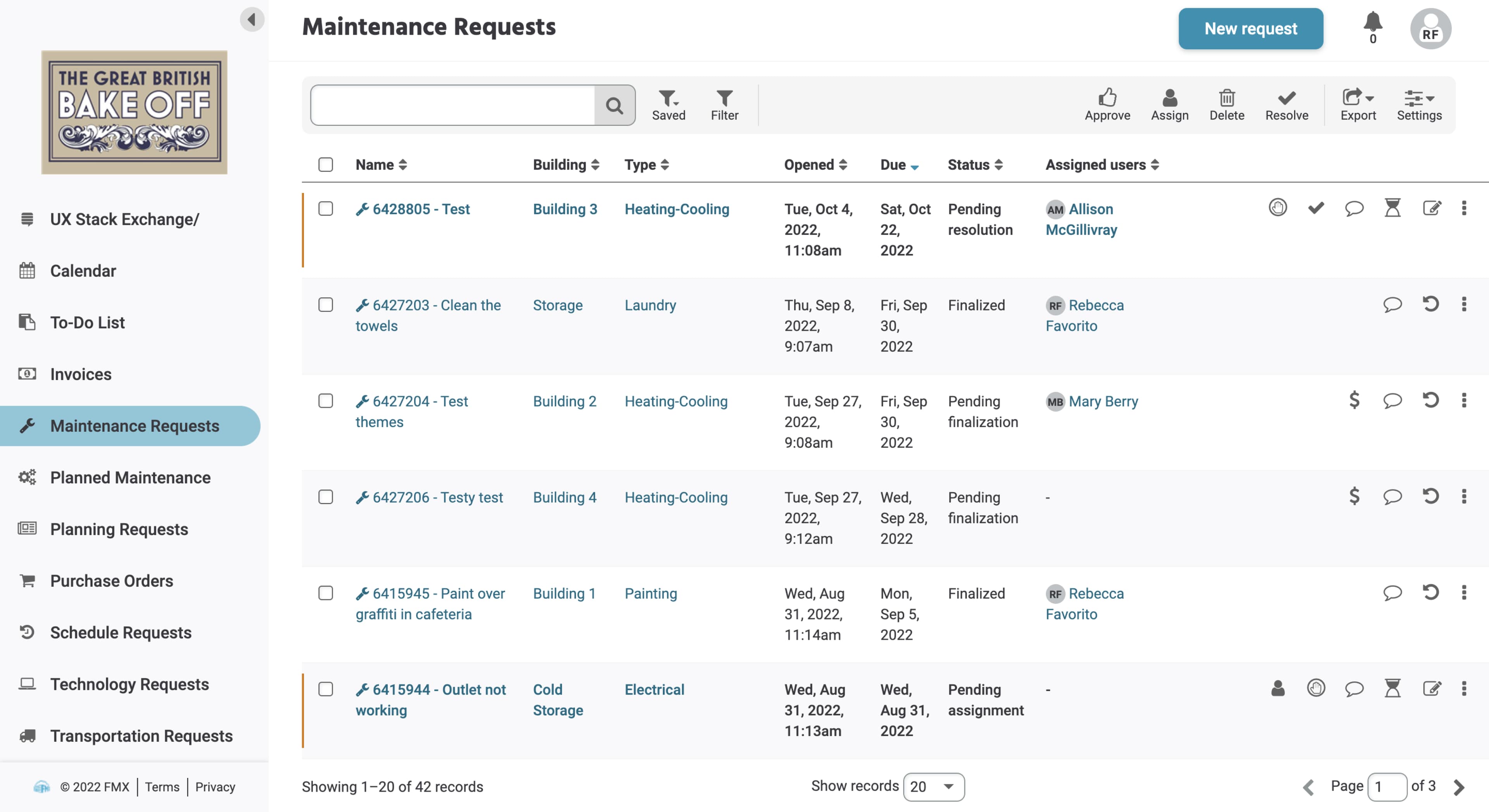
As I made accessibility-focused changes, I made design changes based on both the new brand attributes and on elements pulled from our corporate brand—for example, our corporate brand includes notable rounded elements that I echo in the product brand.
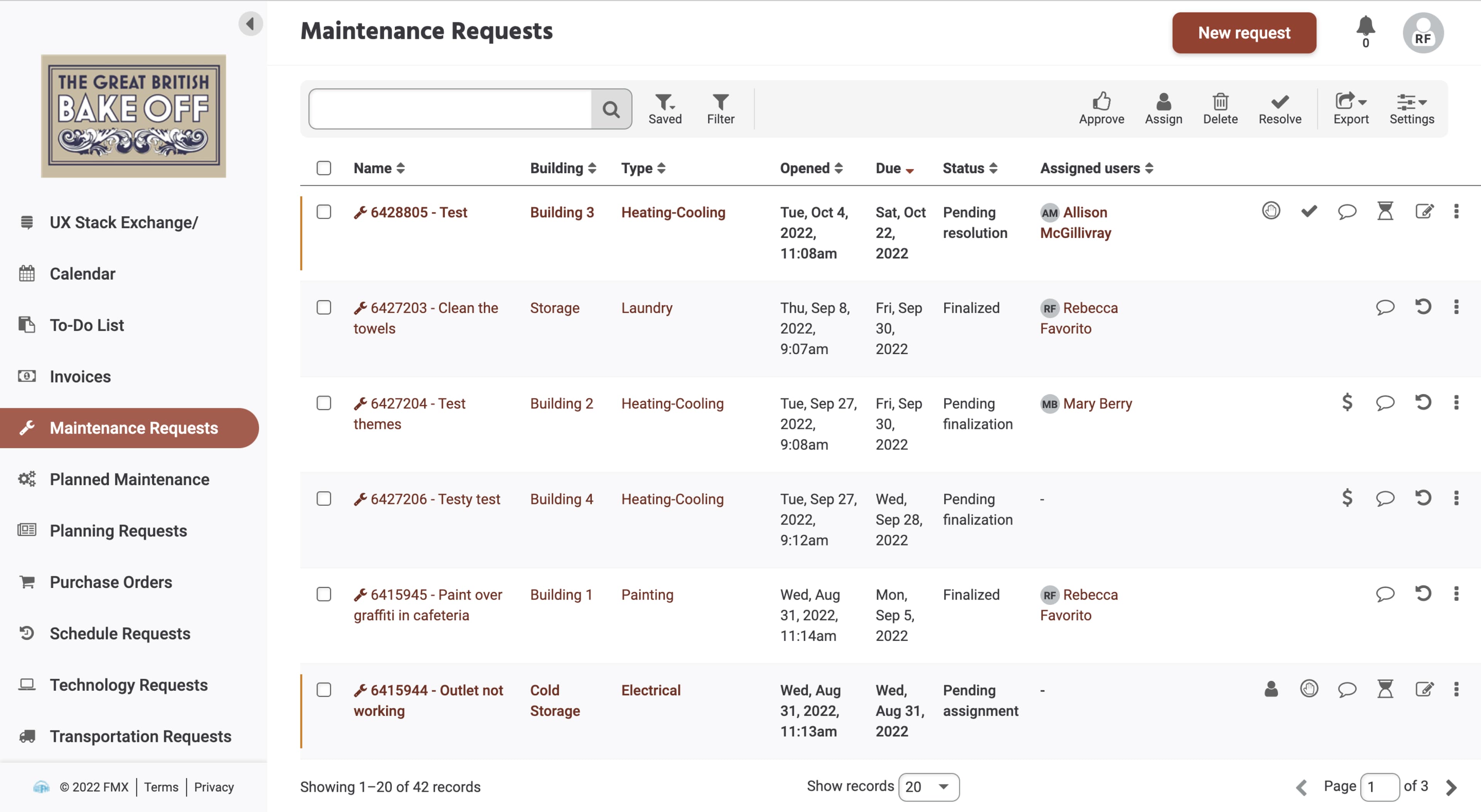
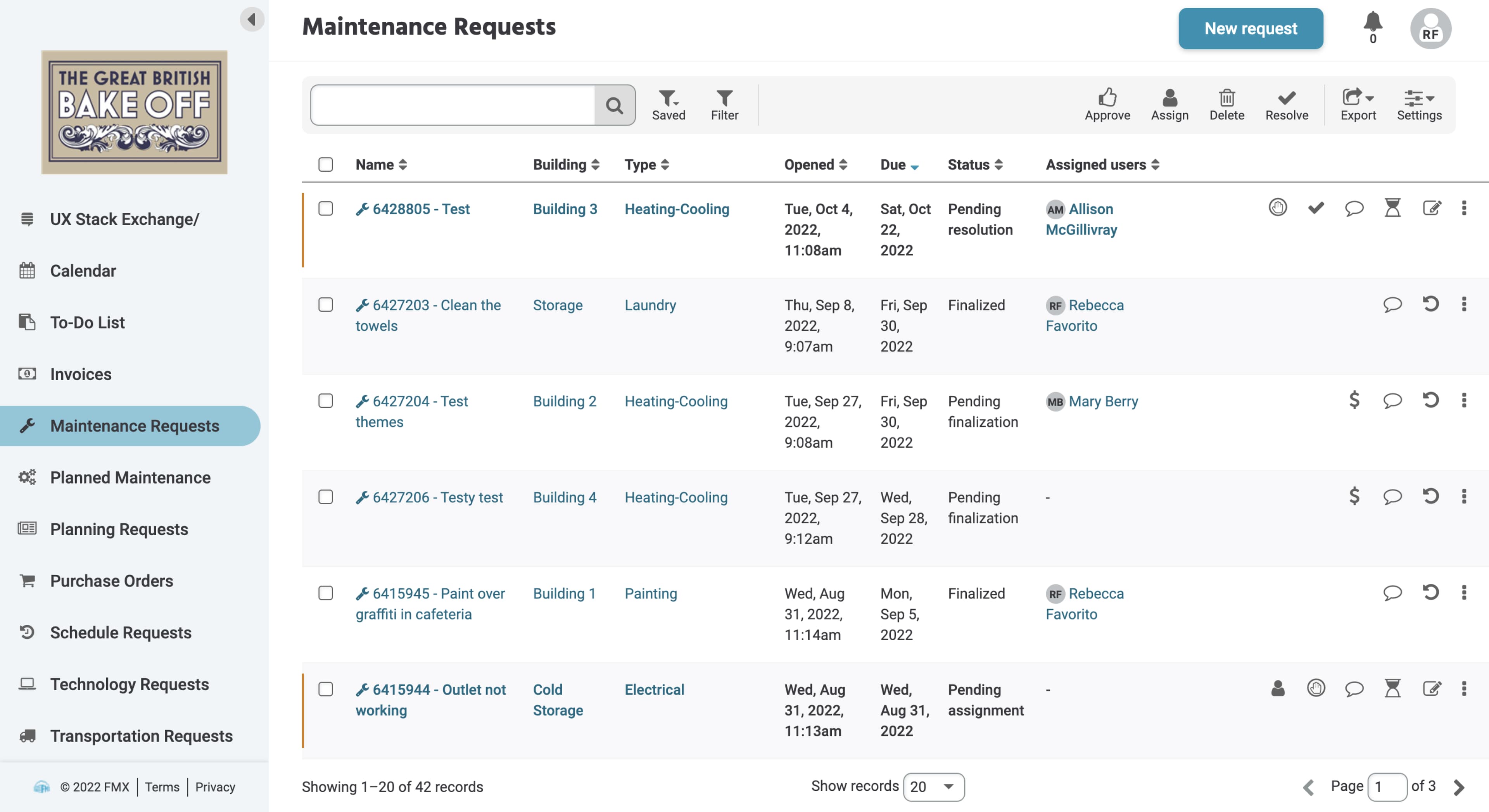
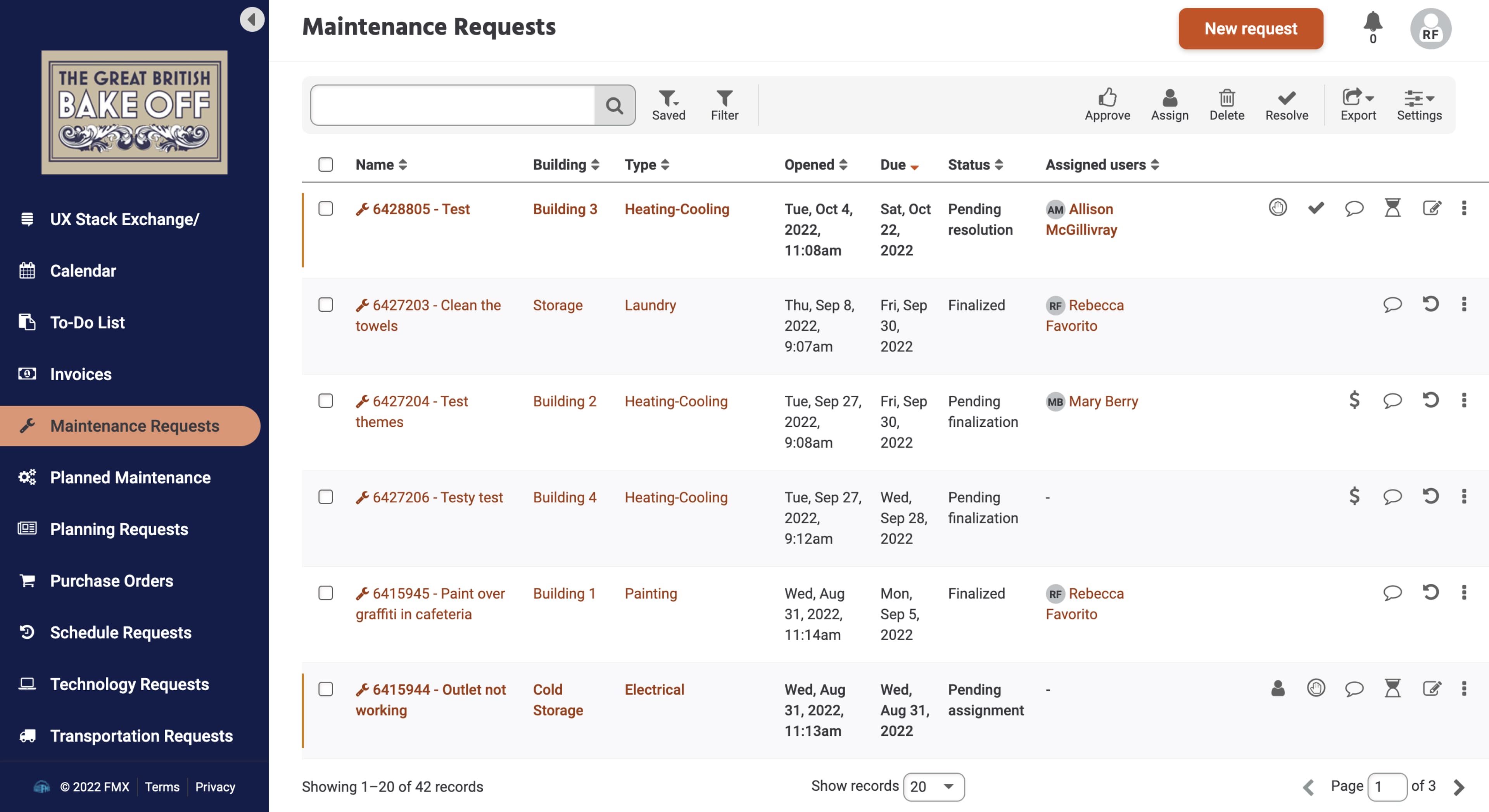
The corporate brand also served as the inspiration for the new product brand themes I designed. I developed three color palettes derived from our corporate brand colors: a semi-neutral Default theme based on our logo blue and grey, a Cool Blues theme that incorporated more shades of blue, and a bold Naval Orange theme that highlighted our orange brand color. The themes are applied at the organizational level.
I also created a color palette–FMX Retro–based on our old brand colors. This might seem like an odd decision, but we knew from experience that significant UI changes could be disruptive to our customers. My team decided to address this disruption strategically by first applying the UI updates with the familiar color palette to minimize confusion and allow users time to acclimate to the new themeable UI.
Accessibility and usability updates
- New color palette to meet WCAG AA color-contrast ratios
- Updated font sizing and line spacing to meet WCAG AA guidelines
- Tab order updates
- Hierarchical heading structure on every page
- Revampled interactive component usage for consistency and intentional usage
- Native HTML element usage
- Recommended use of ARIA labels as needed
- Clear hover and focus states on every interactive element
- Increased touch target sizes, especially on mobile view
- Grid-row density options with “relaxed view” for accessibility
- Added white space
- Added breadcrumbs for easier navigation
- Decluttered grid by reducing extraneous icons and buttons
- Replaced mobile dropdown menus with slideouts
- Moved some elements, such as profile/account, to new places in layout to match user mental models
- Added text labels to buttons for ease of use
- Made “overdue” indicator more distinct
- Made grid column heads and action buttons sticky to reduce cognitive load and scrolling
- Added scrolling and progress indicators where missing

Customization
We decided to present users with theme options to live up FMX’s reputation of being highly configurable and to allow for some of the customization that our users had been requesting. We will continue gradually adding built-in themes that will serve the needs of our current primary market—K-12 schools—by basing the new themes on common school color combinations. To meet the needs of our enterprise customers and other customers desiring even greater customization options, however, we also decided to build in the ability to add custom themes for white labeling.
Implementation
We took a phased approach to rolling out the new UI to make best use of our development resources and allow our users to acclimate to the changes.
Phase 1: Updates
Early changes included updating the typography, implementing a standard hierarchy of headers on each page, and ensuring all interactive components were tabbable and had clear focus and hover states. We applied the following strategy:
- We identified the most important components and updated those first, and then moved through the product until all components were updated.
- As we made these updates, we implemented the FMX Retro theme, which was close enough to the existing colors to serve as a bridge during this incremental updates and allowed our users to get used to the layout and component changes before we introduced new themes.
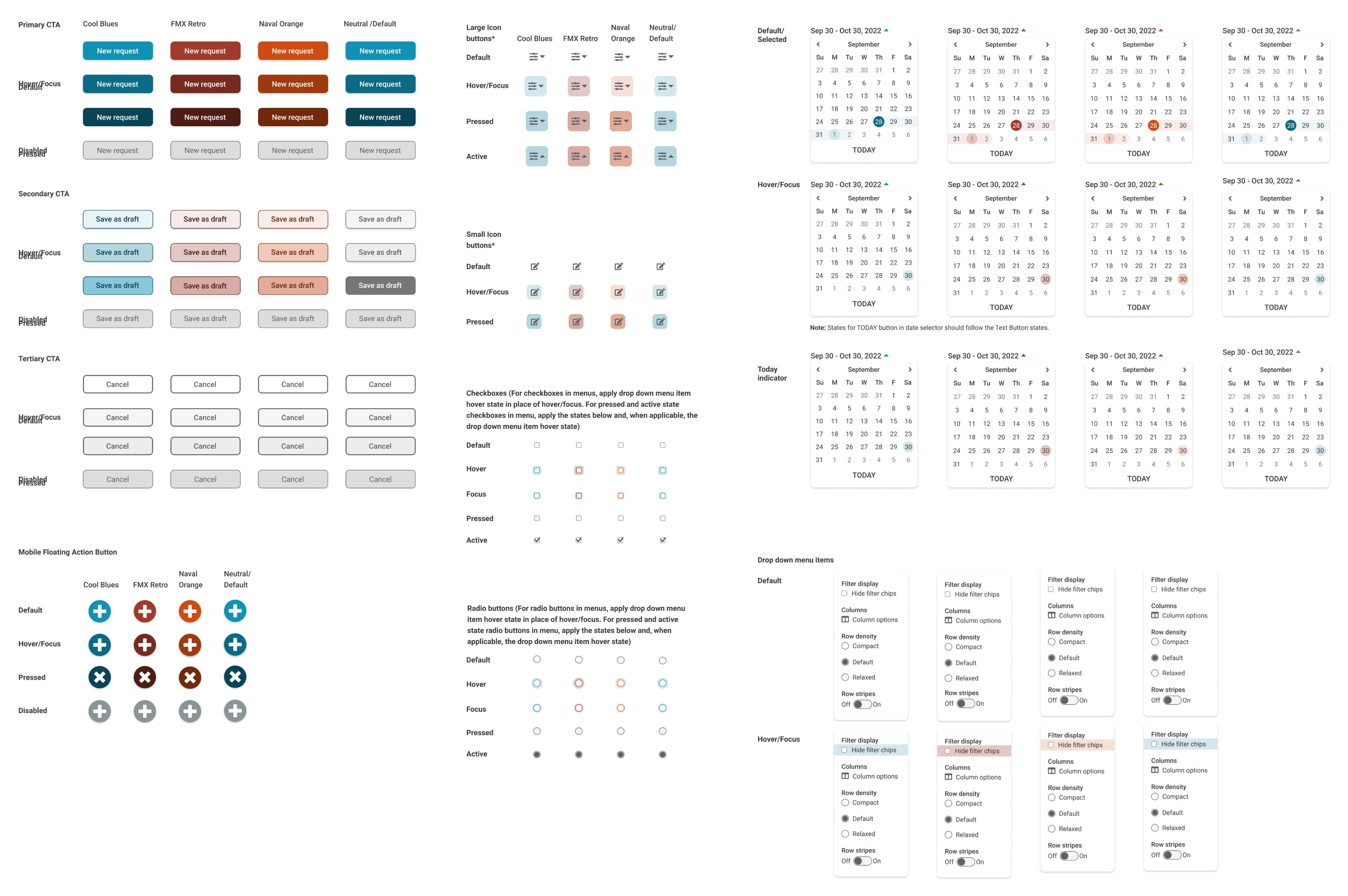
To help the developers implement the themes and make future mockups easier to create for the design team, I created a design guide that now serves as a proto-design system for both the Core Product and R&D teams. Unfortunately, we didn’t have the time or resources to create a design system at this time.
Phase 2: Brand Themes
When we then added the new brand themes to the product, we applied our new “Default” theme for all new customers, but kept “FMX Retro” as the selected theme for our current customers. We used in-app messaging and other tools to notify our customers of the new theme feature. This minimized disruption for our customers and allowed them to determine when and how to apply a new theme to their sites.
Phase 3: White Labeling
The last step was to implement white labeling. This proved to be trickier than anticipated because of how color is used in the product (see Color Challenges). Our goal was originally to have a built-in UI that would allow customers to create their own themes on demand. But we determined that it would be challenging to preview the effects of this for customers and nearly impossible to ensure good results and continued accessibility without a lot of additional research and development work. So for now, the implementation requires the FMX design team to be involved in creating or vetting color palettes for custom themes.
As a result, we’ve rolled this feature out as a beta program that currently includes three enterprise customers, including a nation-wide fitness center chain, an NFL franchise, and a key K-12 school district. If testing goes well, white labeling will become an upsell feature and we’ll continue to explore better ways to implement it.
Color Challenges
To succeed at this project, I had to do a deep dive into color theory and applying color to create accessible interfaces. It was a big challenge! Originally, my goal for the Default theme had been to use a grey color palette to indicate interactivity/states for secondary and tertiary buttons; however, since several parts of the product have a grey background, it proved too challenging to do so while maintaining accessible color-contrast ratios.
Since the Default theme was supposed to serve as the base for allowing custom themes, this problem affected how we implemented custom themes. We were going to have customers choose only a primary accent color and retain the grey for secondary and tertiary buttons, but ended up having to allow for more sophisticated color palette creation for custom themes as we needed nine shades of the primary accent color to apply throughout the interface.
Currently, this means I work with the customers interested in custom themes to develop the color palette for their themes. Once a customer has approved a color palette, I edit a CSS file that a developer uses to upload the theme to the customer’s site.

Next Steps
The customer response to our brand updates has been overwhelmingly positive, but we’re still working on measuring the effects of the changes. The limits placed on the scope of this project meant that some parts of the interface—such as the layout of our forms—were left mostly untouched. Based on my initial research, there is still a lot of room for improvement in these areas, so I will be gathering data through customer feedback research, surveys, and other methods to determine whether investing additional resources to continue these UI updates throughout the product will have a good ROI.
Although we were able to make many visual design and some coding changes to improve the accessibility of the product, there are a lot of areas that still need to be improved, especially when it comes to our code base and use of third-party components. I am supervising the work of our junior UX designer as he works to educate our developers on accessibility best practices.
I will also be working with our front-end developer to investigate better ways to implement white labeling in the product, potentially through the use of third-party tools to aid users in creating their own accessible color palettes. We’ll see a better ROI on this feature if we can reduce the need for designer and development involvement in the creation of custom themes.
Image Gallery
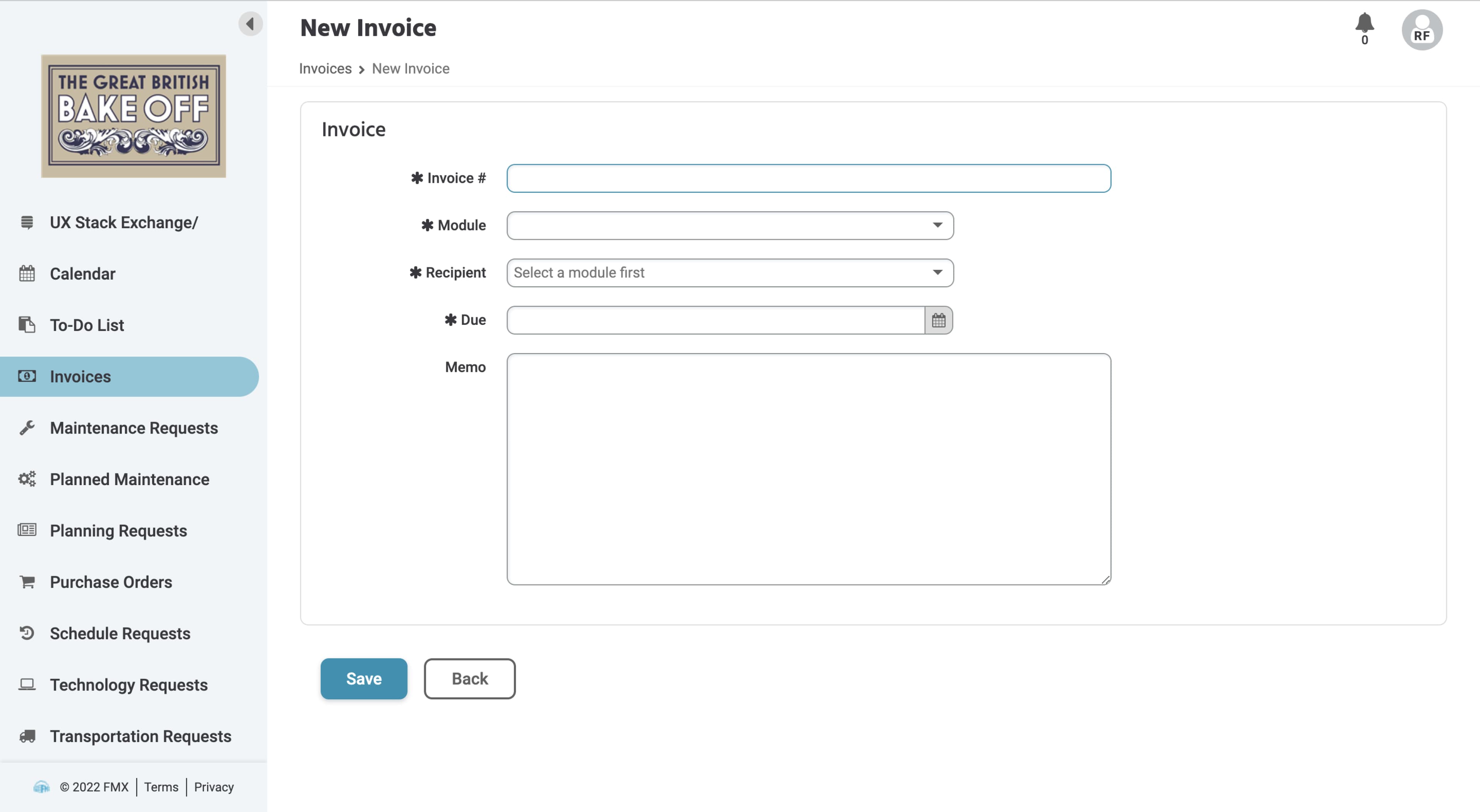
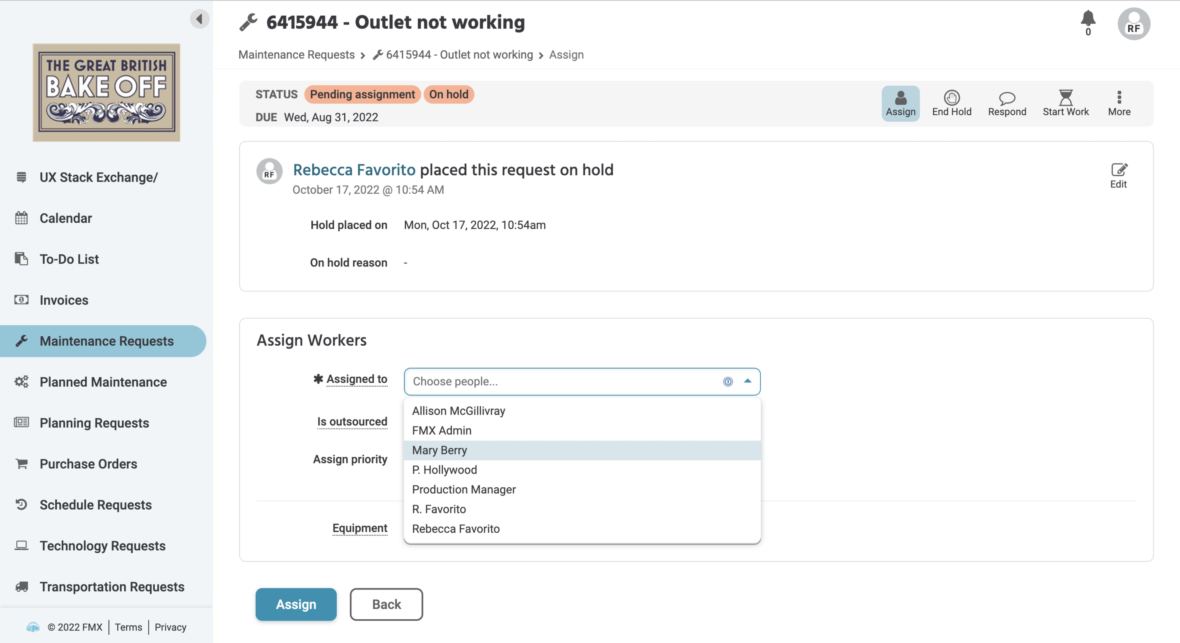
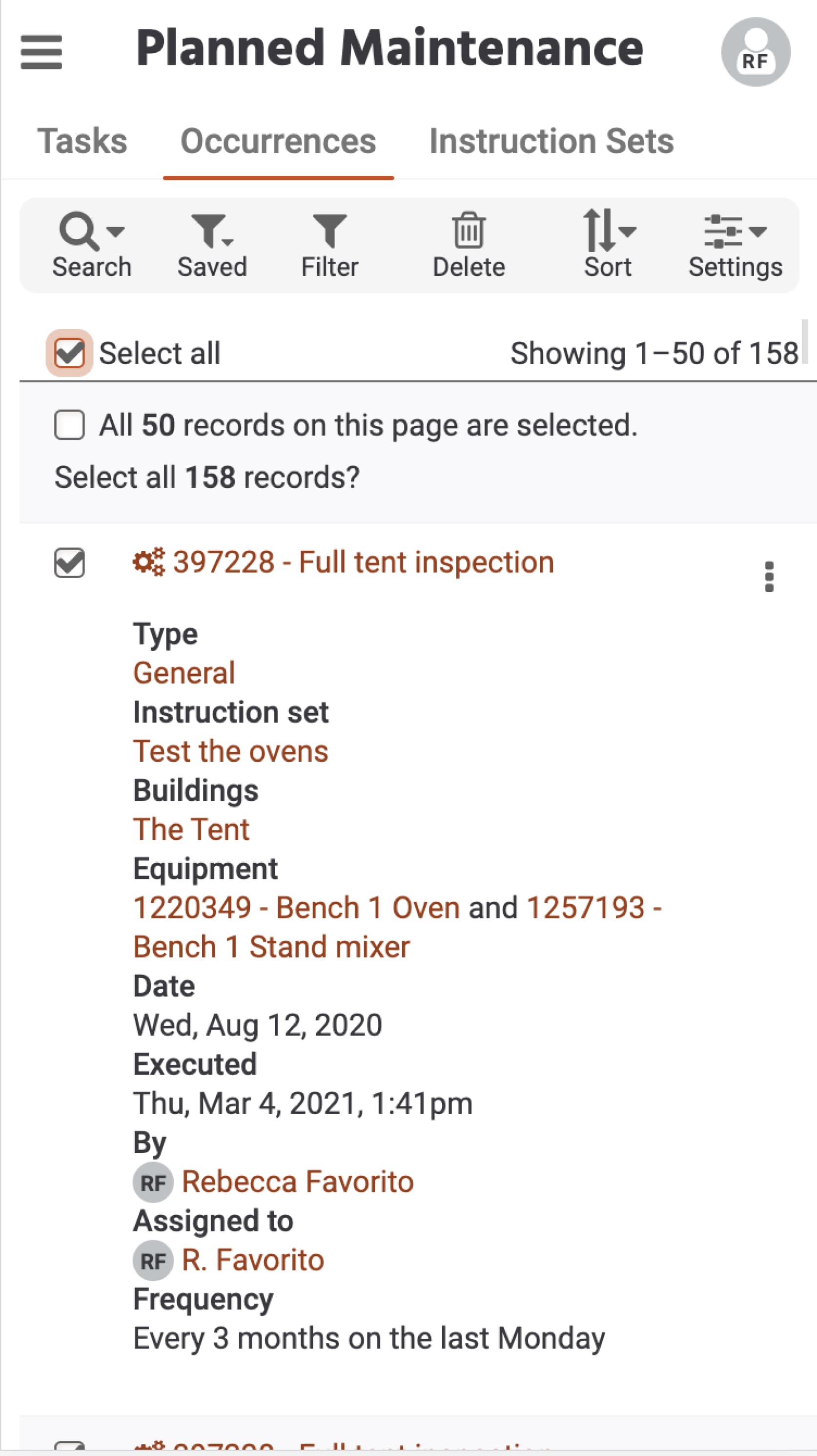
It’s challenging to illustrate the impact of entire product rebrand in a concise case study without including an overwhelming number of images. I’ve attempted to communicate the scale of the changes in my narrative above, punctuated with a few key images, but decided to include more images here for additional reference—and because I’m proud of the work I’ve done!
Released

In progress
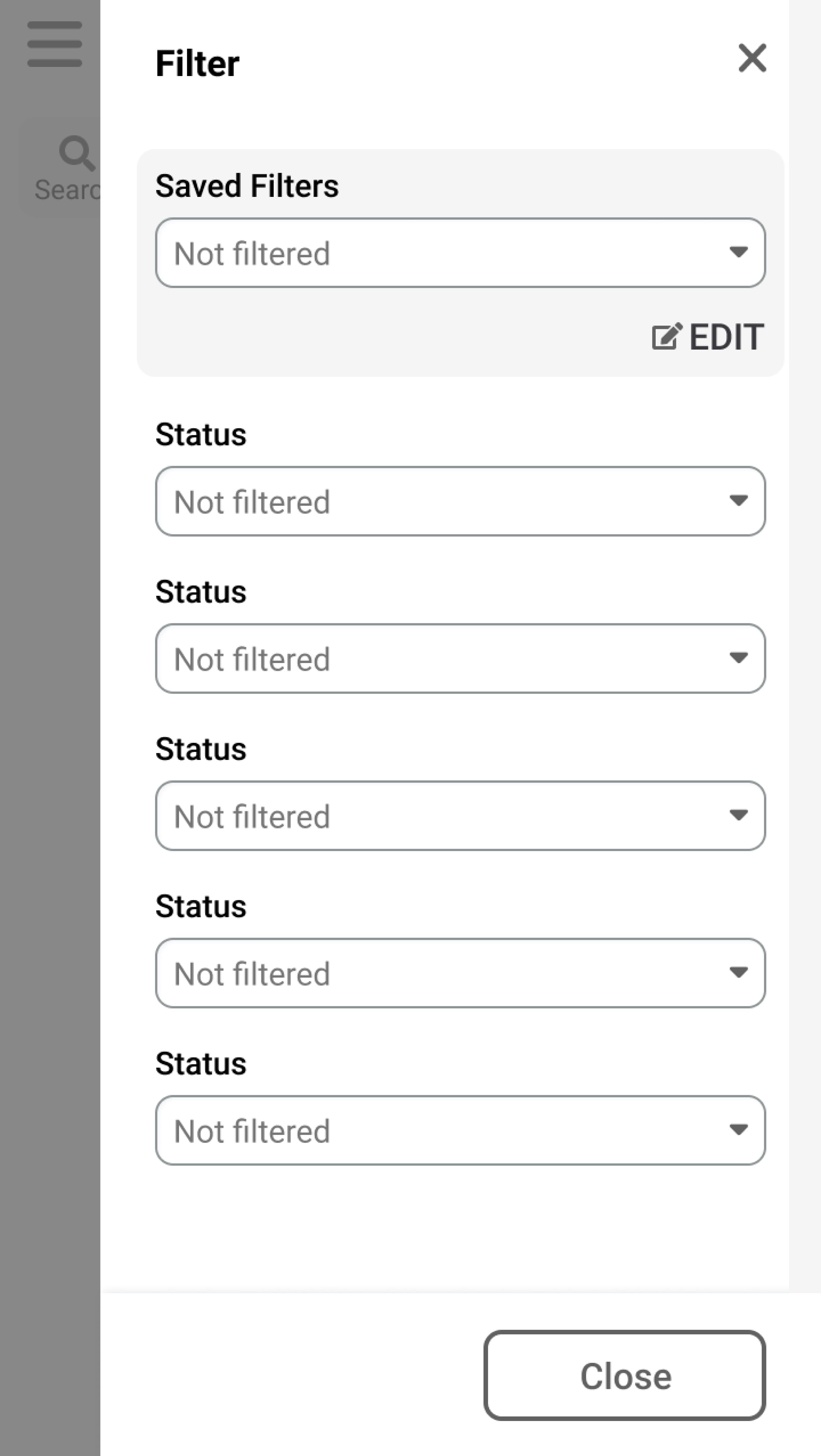
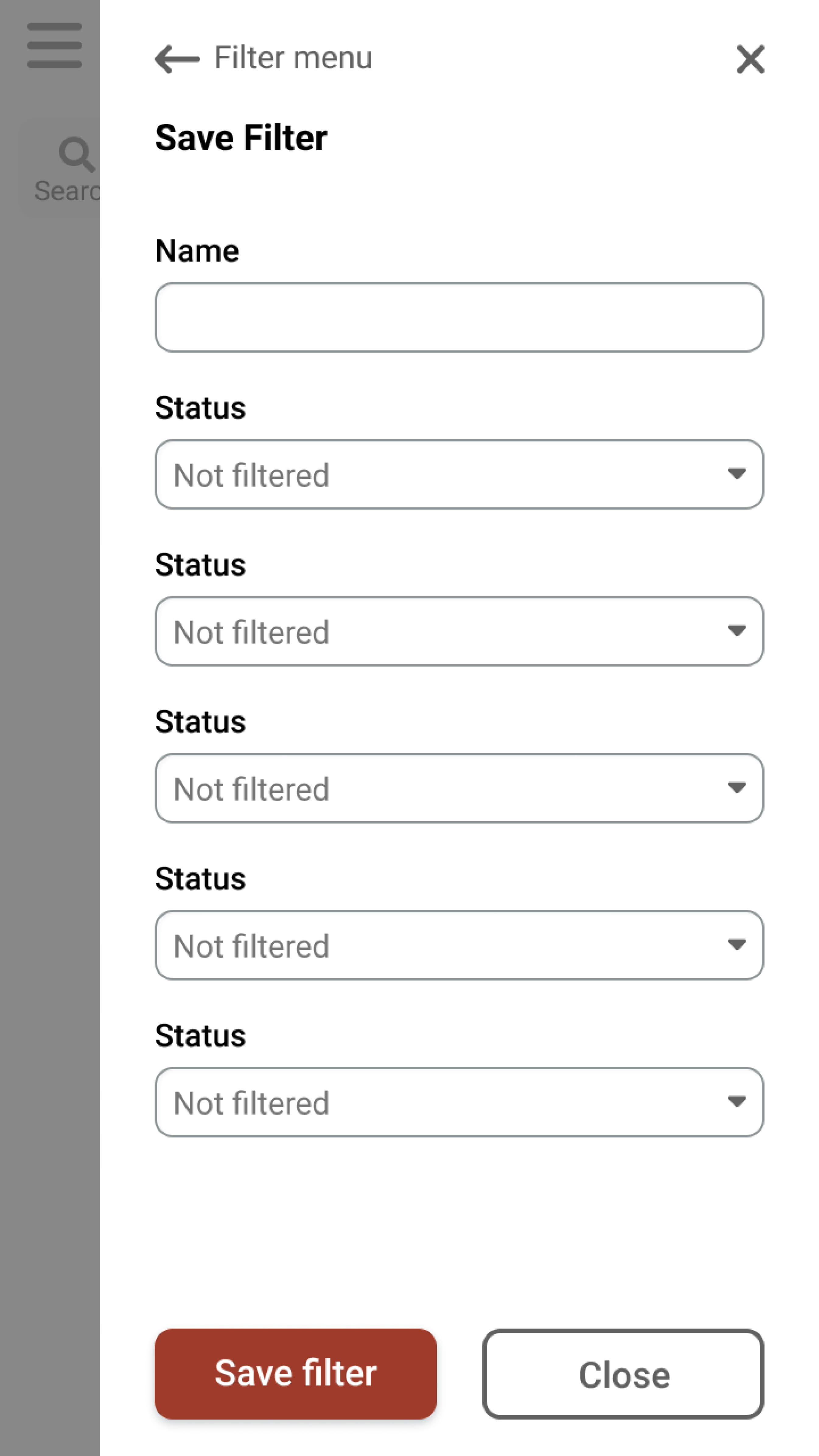
Currently, the filter, sort, and options menus are dropdowns on mobile. Our front-end developer is working on making them slide-out panels instead to improve usability.


Working Files
Examples of files created for handover to developers.
